We Are the World
Jun 9, 2012
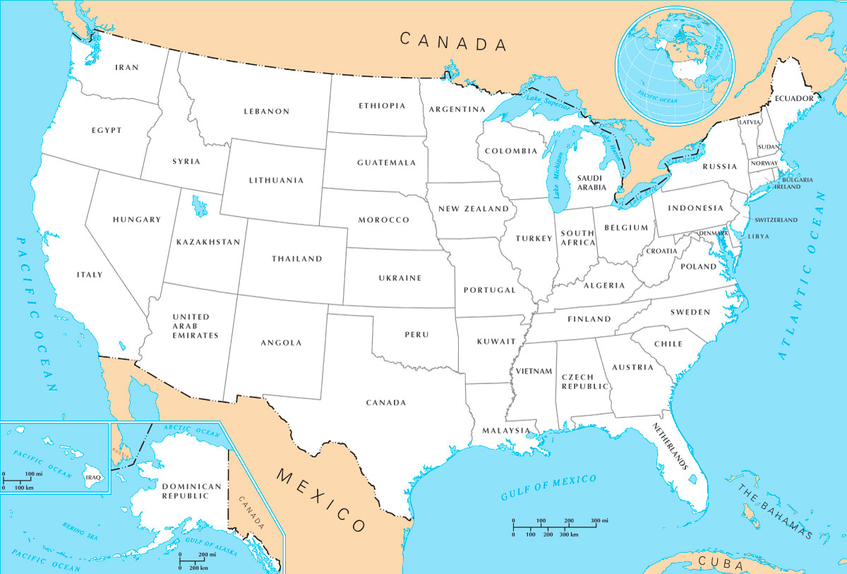 In this map, each of the fifty states has been renamed for the country that matches it most closely in terms of overall economic activity; in other words, the country's gross national product is similar in size to the state's gross domestic product.
For example, if California were its own country, it would have the eighth largest economy in the world, comparable to that of Italy. And if Illinois were its own country--big, bustling, wealthy Illinois--its economy would be comparable in size to that of . . . Turkey? When did Turkey crash this party?
I'm pretty certain that the data shouldn't be used like this; there must be good econometric reasons why countries and states can't be compared so easily, on the basis of a single number. But hey. In 2007, a Norwegian software consultant named Carl Størmer posted a version of this map using older data, and I decided to update it--partly to see if the country-state similarities have changed (they really haven't), but mostly as an excuse to play with a really cool map.
I love seeing all those foreign countries mapped in all the wrong places, and all those American states mislabeled so ridiculously. I like seeing that I grew up in Denmark and recently moved from Ecuador to Indonesia. Who wouldn't like that?