Friends Across the Waters
Dec 27, 2010
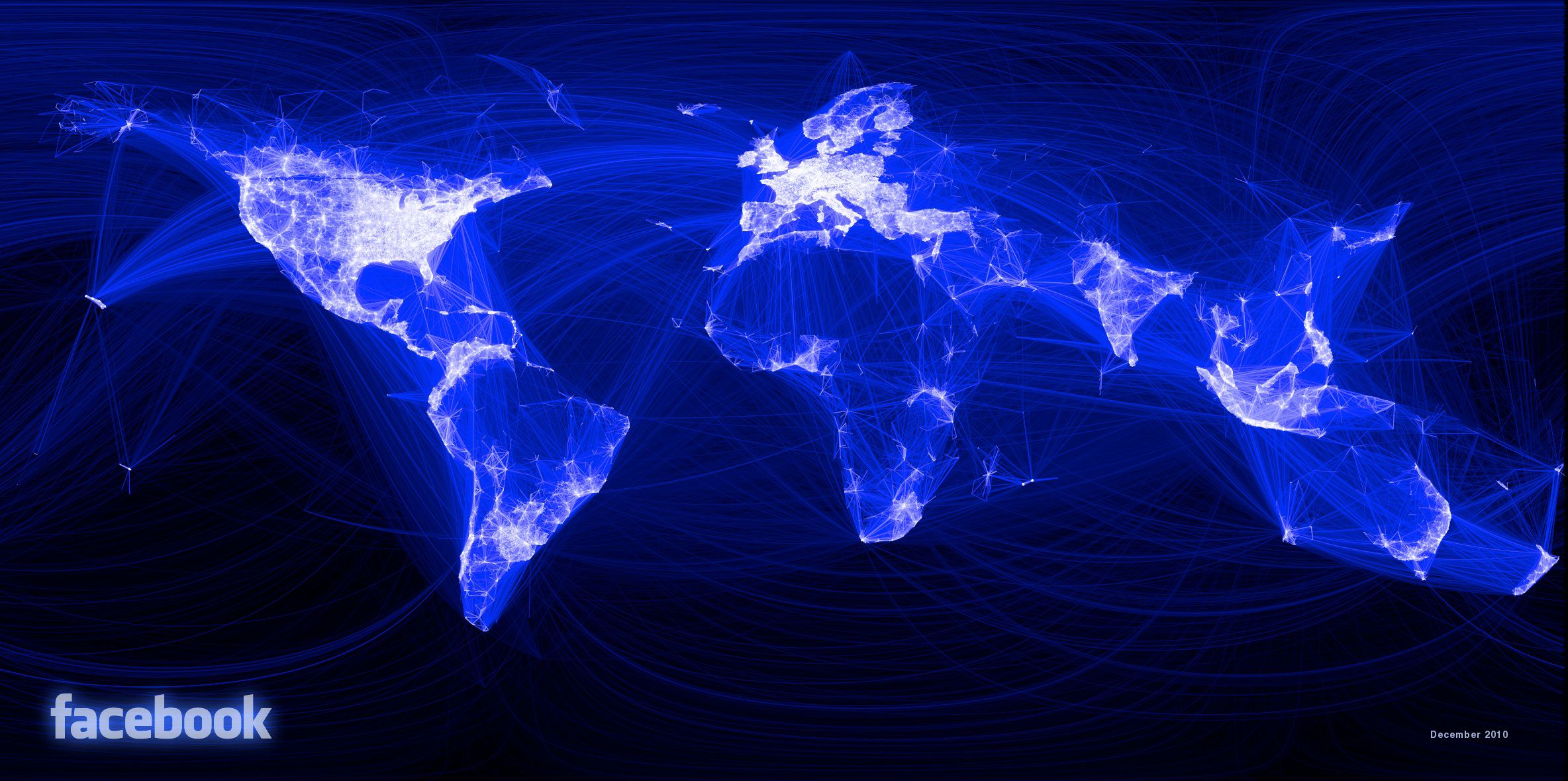
Five hundred million people have Facebook accounts. They have Facebook friends. Some Facebook friends live in the same city as one another; others may be separated by thousands of miles. Here we see the world as reflected in pairs of Facebook friends: brightly lit where many friends are linked via Facebook, and dark--as in Russia and China--where people use other social media or rely on pre-digital forms of friendship.
Two things I like about this picture: one, it's a map of much of the world made without drawing any coastlines or national boundaries or any other geographic features. Instead, all the lines we see here portray human relationships. "Each line," notes Paul Butler, who created the image while working as a Facebook intern, "might represent a friendship made while traveling, a family member abroad, or an old college friend pulled away by the various forces of life."
A second cool thing about this map: it was rendered in a very clever way. From all the friend data in Facebook's repository, Butler selected a random sample of 10 million "friend pairs." He noted the latitude and longitude of the current city location of both members of each friend pair. Each pair was to be represented by a line connecting the two friends--not a straight line, but a "great circle" curve, trigonometrically adjusted to account for the roundness of the earth.
Those of us who've fiddled with mapping large datasets can easily predict what happened next, when Butler told the computer to plot his 10 million friendship lines: he got a big, incomprehensible shaggy-looking blob. There is too much overlapping data. Butler reduced the number of lines in his diagram by adding together all the friend pairs in the same cities--for example, all the friend pairs with one member in Honolulu and another in Los Angeles. All the Honolulu-Los Angeles friend pairs would be represented by a single line--a very faint line if there were very few such pairs, or a bright, bold line if there were many.
A second factor used to weight the friend-lines was distance. Friend pairs within a single city or in nearby cities are obviously numerous and would tend to clog up the map. So short lines were set to be relatively more transparent than long lines. The result is a dramatic display, easily understandable, of millions of data points--an exercise in statistical visualization that became, of course, a Facebook page.
In Facebook, 2,097 users gave Butler's map a thumbs-up, and hundreds submitted comments. The most common comment was: I want a map like that showing me and my friends.
It can't be long before there's an app for that.